Cave Eaterie

Cave Eaterie — New identity created as part of an ongoing project. After completing the identity, we have embarked on their 2015/16 campaign consisting of restaurant materials, corporate stationery, packaging, website and print materials. 

Scott & Ross

Identity work for London-based law practice Scott & Ross. The project included logo creation, stationery set and a responsive website design and build.

LIDA

We created the new identity for the creative design and marketing agency —LIDA — part of the M&C Saatchi group. We combined a simple, yet bold typographic logotype —  with a mix of iconic pen illustrations and GF Smith paper stocks. 

Six Degrees

This is Responsive live text that can be edited for each project it is used to introduce the work that follows. A description of the brief set — the challenges met and the solution provided.

Enable

Identity work for London-based design practice Enable — The project included logo generation and pictorial mark, stationery set and responsive website design and build.

John Lewis Directory

Our art direction and graphic design of the printed John Lewis Directory — introduces a simple asymmetric cover grid — unifiying all printed materials — with clean elegant typography and a new art direction for photography and illustration.

John Lewis Way-finding

We were approached by the quintessential stalwart of the British high street — John Lewis to review and refresh it’s brand. 

As part of our branding solution we created a bespoke way-finding system — We introduced super-graphic illustrations to act as key visual markers for departmental and product adjacencies — Hanging signs were designed to reflect the characterisics of the brand with an introduction of a chevron edge and new colour palette.

The new way-finding system includes super-graphic illustrations, hanging signage, perimeter decals and floor directories.

John Lewis Leaflets

Our art direction and design of the John Lewis product and service leaflets introduces a simple asymmetric cover grid —unifiying all printed materials — with clean elegant typography and a new art direction for illustration. 

We created a communications hierarchy through the use of different colour and illustration styles.

John Lewis Home

Our art direction and graphic design of the printed John Lewis Home directory — introduces a simple asymmetric cover grid — unifiying all printed materials — with clean elegant typography and a new art direction for photography and illustration.

BBC Frame

BBC Worldwide required a brand identity that would encompass all the premium drama the BBC produces in order to bring it to a global market.

The creative demonstration of the brand had to show how it could live both on and off air across multiple platforms as an aspirational brand beyond the linear — Providing a compelling brand interface for a global marketplace.

Barclaycard

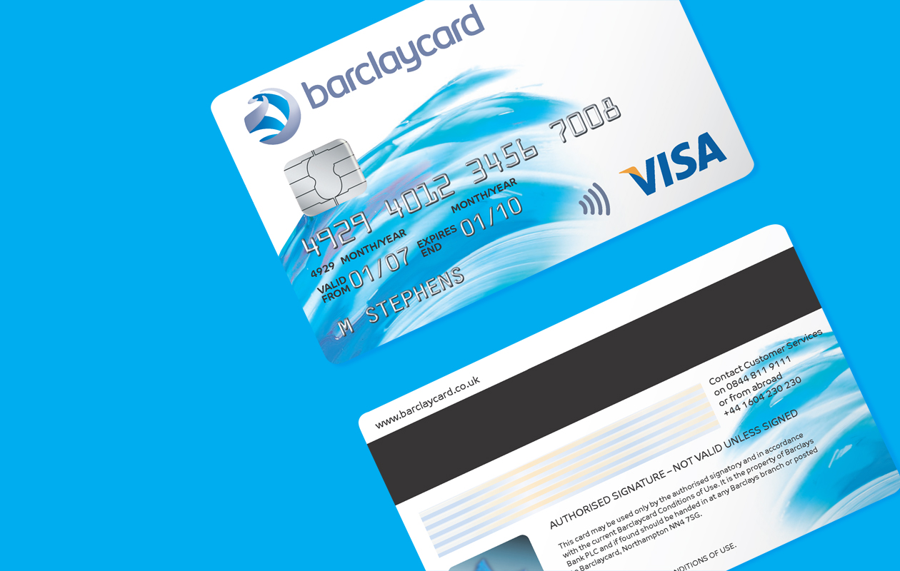
Open World — The new brand identity created for Barclaycard is inspired by the central idea of liberation  — ‘When liberated from the complex world of payment, a new and brighter world opens up, free from restriction, free to explore and experience new things’.

We created a multi-coloured brand designed to express an Open World, full of opportunity and choice. The Open World mark is calm and controlled on the outside, yet progressively more vibrant and dynamic closer in.

The brand was expressed across cards, corporate stationery, customer statements, website graphics, mailers, and printed promotional material amongst other deliverables.

Barclaycard Unwind

This is Responsive live text that can be edited for each project it is used to introduce the work that follows. A description of the brief set — the challenges met and the solution provided.

Ask

This is Responsive live text that can be edited for each project it is used to introduce the work that follows. A description of the brief set — the challenges met and the solution provided.